Studio

View All Tags

Overview

A small release in terms of features shipped, but one that sets the stage for us to do some big things in the coming weeks/months!

Complete List of Resolved Items

    • Feature - Several UI & backend adjustments.
      • Feature - Backend work for syncing purchase history from Shopify.

Overview

Release 143, was one of (if not the) biggest releases we've ever done. With this release a number of banner features went out as well as more than two-dozen bug fixes.

Better Media Component

With this release, we pushed out a new version of our Media/Text component that allows for much more control over its appearance and behavior.

Spacing/Width Defaults (Desktop & Mobile)

We’re on a quest to enable sites of any width. In this release, we’ve introduced settings in the style guide that allow you to adjust the default width of sections. As a bonus, we’ve also introduced the ability to configure default padding on desktop and mobile.

Box Shadows

With this release you're now able to add shadows to any box.

Sticky Buy Button

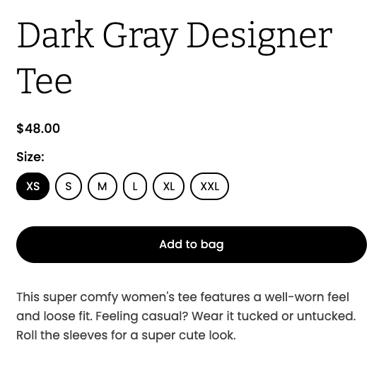
When a page with a product component on it is viewed on mobile, an "Add to Cart" button will now follow the user as they scroll down the page.
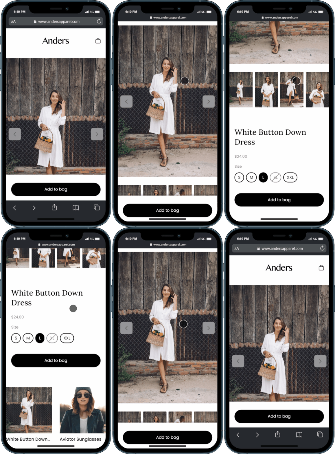
Add to Buy Button

Triple Whale Integration

For all our Triple Whale users out there, we've update our official integration to include support for add-to-cart event tracking!

PostScript Integration

We've also launched an official PostScript integration!

Product Collection Drag & Drop

With Release 143, products in a collection are now drag-and-droppable! The hope here is to make it easier to rearrange items displayed in a collection.
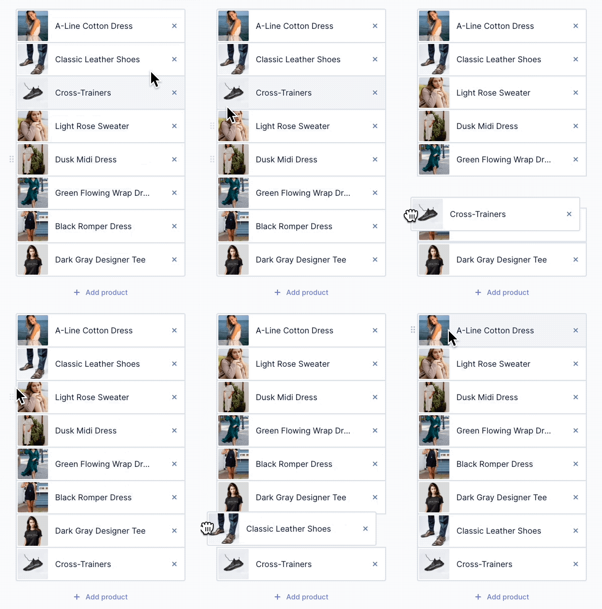
Drag and Drop Product Collections

Recently**Used Components**

Another change that everyone will love; there's now a component category for Recently Used that shows the last ten components you've used.

Immediate sync of 5 most recent products

We changed the way that our sync job works so that as soon as you connect Unstack to your Shopify store for the first time, the five most-recently-updated products will be synced from your account. The aim here is to help more people start building more quickly and to make it a more seamless experience the first time someone loads their Unstack account.

Complete List of Resolved Items

Better product component

  • Feature - Sticky buy button for mobile
  • Bug - Fixed an issue where product component images weren't loading properly on liquid header/footer sites.
  • Bug - Fixed an issue with gallery interactions when full-screened.
  • Bug - Fixed an issue where selecting one variant option would activate the add-to-cart button.

Better product collection components

  • Feature - When a header is added to the product collection component, the actions are now located to the right.
  • Feature - Drag and drop now supported for editing product order in collections
  • Bug - Fixed an issue where price wouldn't show up properly in the editor for products added to a collection component.
  • Bug - Fixed an issue where hitting "enter" when searching for products in the collection component would reload the page.
  • Bug - Fixed an issue where the header of a product collection component wasn't editable.
  • Tweak - Removed backwards compatibility for link behavior key
  • Bug - Fixed an issue where multiple toolbars would appear when hovering over text in the box component.
  • Bug - Fixed an issue where header and footer smartlinks to products wouldn't properly open if set to popup.
  • Bug - Fixed an issue where marking a product as a "draft" in Shopify would break any smart-linked buttons in the editor.

Editor Improvements

  • Feature - Added support for shadow settings on the box toolbar
  • Feature - Added "Recently Used" component category as the default for component selection.
  • Tweak - Made a change to the clickable area for toolbar dropdowns to make it easier to interact with the options.
  • Tweak - Made a change to the paint can icon so that it now properly indicates when an option is selected.

Style Guide Improvements

  • Feature - Added Style Guide support for width and padding defaults on both desktop & mobile.
  • Tweak - Made several improvements to the initial styles scrape that takes place when you first connect Unstack to Shopify.
  • Bug - Fixed an issue where adding a new heading wouldn't inherit the configuration of the most recently configured heading.
  • Bug - Fixed an issue where the text "Light Background Color" was being cut off in the Style Guide.
  • Bug - Fixed and issue where the styles-scrape job would sometimes fail to grab a Brand Primary

Components

  • Feature - Added new version of the media/text component.
  • Bug - Fixed a bug where certain components were returning "Unable to load component" errors.
  • Bug - Fixed a bug where errors would appear when a Vimeo video was embedded on a page.
  • Bug - Fixed an issue where rich text would run outside of "Box/Variable" component.
  • Bug - Fixed an issue where the hover effect of a button would appear incorrectly on dark-themed components.

Shopify Syncing

  • Tweak - Adjusted our initial product sync to first sync the five most recent products before continuing the job.
  • Bug - Fixed an issue where some products would pull in multiple versions of the same variant.
  • Bug - Fixed an issue where the initial sync would very rarely get stuck and would prevent future sync jobs from working properly.

Integrations

  • Feature - Added a PostScript integration.
  • Tweak - Adjusted our Triple Whale integration so that it fires add-to-cart events.

Templates

  • Bug - Fixed an issue where some template thumbnails were not correctly generating due to animations on the pages.

Storefront

  • Bug - Fixed an issue where certain storefront collection templates were returning 500 errors.

Media

  • Bug - Fixed issue with system error messaging when trying to upload a file that is unsupported.
  • Bug - Fixed an issue where media height wasn't matching html <img> height attribute.

Other

  • Bug - Fixed a bug where the Unstack admin sometimes showed a card background behind the app pagination options.
  • Bug - Fixed a bug where changes to the article sidebar wouldn't always be reflected.
  • Bug - Fixed a bug where the editor would load indefinitely for a user if they came directly from the Style Guide.
  • Bug - Fixed a bug where the adding a custom integration would offset the (+) button to add additional integrations.
  • Bug - Fixed a bug where embedded forms would hover over header logo and text on mobile pages.

Overview

This release is a massive one for us, but the notes on what is included are very, very short. This release was all about getting something that we've been wanting to release for quite some time - Media Micro Service (MMS).

MMS will allow us to improve the ways that Unstack handles images and unlocks a couple paths for us to do some cool stuff with media going forward. We don't have anything to share on this at the moment, but promise that we will have more to come on this at a later date.

Complete List of Resolved Items

  • Other than MMS, no other fixes or adjustments went out with this release.

Overview

With this release we shipped Smartlinks for products and a number of improvements to our Klaviyo integration.

Smartlinks for Products

With this feature release it's now possible to turn any link or button into an "Add to Cart" button.

Simply enter the name of the product and select it in the auto-complete menu for the link. Then choose “Add to cart” from the action dropdown.

Identifying Klaviyo Users

With this release we rolled out a series of changes that unify Klaviyo's user IDs with CX-Studio's user IDs. This makes it possible to build conditional content based on Klaviyo data which drastically expands our personalization capabilities.

Complete List of Resolved Items

  • Updated the intro video used in the page editor.
  • Resolved an issue where template options weren't sorting properly.
  • Resolved an issue where non-ecommerce prebuilt sections were showing in ecommerce accounts.
  • Fixed an issue where the images in "Logos" components were broken when using liquid header/footer
  • Added NoML support for defaultBorderWidth, defaultBorderColor, defaultBorderRadius, and default BorderStyle.
  • Fixed an issue where the editor would sometimes crash on older Shopify accounts.
  • Improved the way that Studio handles product deletion. Now if a product is deleted from Shopify, all CX-Studio pages with references to that product will be unpublished.
  • Fixed an issue where the price shown in the product component wouldn't appear properly on both light and dark backgrounds.
  • Implemented a way for Studio to make a distinction on whether a variant is a specific color option.
  • Added support for arrow functions (ex: =>) in the section editor.
  • Added support for linking directly to products via smart links.
  • Fixed an issue where text added to the "Box Callout (Split)" component would display outside of the box when rendered.
  • Fixed two bugs with "Gallery" component; one where there was extra space on top of the first row of images, and the second where text underneath the gallery images would align centered in the editor but would align left in the rendered version.
  • Fixed several issues with the "Side by Side Media" component. One where alignment wasn't working properly, another where text and the (+) icon would overlap, and finally one where we changed the terminology used with alignment on the component; instead of "Left/Right" it now says "Default/Reversed".
  • Changed the order of alignment properties on all components; instead of "Center, Left, Right" they know show as "Left, Center, Right".
  • Added support for matching Studio users to a Klaviyo Exchange ID - if applicable.
  • Updated developer documentation with new screenshots, and added notes for using <Generator>, using <Product> generator, and for working with layouts, component properties, and plugins.
  • Updated contact sync process so that accounts with a large numbers of contacts are processed in a more efficient manner

Overview

Release 140 had a little bit of everything with improvements to our Klaviyo integration, margin controls, better CSS targeting, and app performance topping the list. We also managed to squash a bug where some users were getting multiple new lead email notifications.

Margin Controls

We rolled out some changes to the style guide that allow you to adjust margins on headings and text. This should give users greater control over how their site looks.

Targeting Sections and Boxes with Custom Code

We rolled out a number of changes to enable targeting of specific boxes or section with custom code. This will be particularly helpful for any of our users who want to use custom CSS or custom JavaScript.

App Performance

We also rolled out a change in the way that the Unstack app loads our JavaScript packages. This should make it much snappier when loading in the browser

Fixed issue with multiple lead notification emails!

A number of customers were reporting multiple notifications were being sent when forms were filled out. This was a persistent issue over a couple of weeks so if you're reading this and you see the issue again please let us know!

Media Upload Limit Changed to 50mb

A welcome change for video and large images, we’ve changed the upload limits to 50MB from 10MB.

Klaviyo Integration Improvements

We've added support for pushing events to Klaviyo for Viewed Page, Viewed Product and Added Product to Cart.

Complete List of Resolved Items

  • Removed the hover effects on product component media when hovering in the editor.
  • Updated the add to cart button on live pages to appear as "disabled" until a variant has been selected.
  • Fixed an issue with the collection component that would prevent the toggled header from being edited.
  • Fixed an issue where collection components were using a products last image rather than the first image.
  • Fixed an issue with the alignment of items in the "Media with Stacked Callout" component.
  • Fixed an issue where the standard Media/Text component was missing on some accounts.
  • Added support for adding CSS classes to sections and boxes within the editor.
  • Added full margin controls for headers to the Style Guide.
  • Fixed an issue where header spacing for H6 wasn't able to be defined.
  • Added support for Klaviyo events; Viewed Page, Viewed Product, and Added Product to Cart.
  • Added support for boolean component properties (more on this soon!)
  • Fixed an issue where official template pages sometimes had their links persist in the new account.
  • Fixed an issue where our support chat would prefill information about the user, but this information was unchangeable. Now this information is fully editable.
  • Improved app responsiveness by changing the way that several third party modules load.
  • Fixed an issue where liquid footers had a form present that shouldn't have been present.
  • Fixed an issue where multiple email notifications were being sent out for the same lead.
  • Updated language for "Quotes" in the Style Guide, to "Large Quotes"
  • Increased the maximum file upload size from 10mb to 50mb.
  • Fixed an issue where some users were getting an error that read "a page with that URL exists" despite no page with that URL existing.
  • Fixed an issue where article previews were rendering hyperlinked text with an extra space.
  • Fixed an issue where smart links on images in the article body weren't working properly.
  • Fixed an issue where custom pre-built sections were being shown before the standard components in the component selector.

Overview

In release 139 we've added a number of new style guide settings and editor improvements!

Box Border Styles

We've made it easy to build round boxes and even add dotted or dashed borders to simulate coupons.

Also, check out that new fancy color picker!

Additional Headings

We're added support for additional header styles. H1, H2, H3 are configured by default, but you are now able to add H4, H5, and H6.

Toggles for product collections

We added toggles for Title & Price to the product collection component. We also made it possible to adjust the gap between products.

Complete List of Resolved Items

  • Added support for border width, color, dash, and radius on box toolbars.
  • Added a tooltip under the page path field so that entering text into that field will now show what the final URL will look like.
  • Added support for H4, H5, H6.
  • Fixed an issue where the color option for Blog H2 wasn't lined up properly in the Style Guide.
  • Fixed an issue where some product sizes wouldn't show up as "in stock".
  • Fixed an issue where the previous image/next image arrows in the product component would be misaligned vertically on first load.
  • Fixed an issue where the second image in a product component would sometimes be pushed to the following row if there was a long product description or many thumbnails.
  • Fixed an error that would appear if were multiple product components were added to the same page.
  • Added support for a "Gap" between items in a product collection component.
  • Added support for price and title toggles for the product collection component.
  • Fixed an issue where products in a collection component would show the prices multiple times.
  • Fixed an issue where the number of columns in a collection component couldn't be changed if a product wasn't already added to the component.
  • Fixed an issue where some 301 redirects weren't properly including the proxy path in the redirect URL.
  • Fixed an issue where entering an operator for the first time when defining a condition would take two clicks to respond, rather than one.
  • Updated the images used in the quickstart section of the Unstack Admin.
  • Adjusted the quickstart integration list to no longer include HubSpot or Salesforce if the user is an eCommerce merchant.
  • Fixed an issue where the bubble behind the number of items in the a users "bag" was showing up as transparent.
  • Fixed an issue where primary button would disappear on hover.
  • Fixed an issue where solo buttons were sometimes misaligned.
  • Fixed an issue where "&" was not rendering properly in the article preview.
  • Fixed an issue where sections with long names forced other sections to wrap to the next line in the section editor list.
  • Fixed an editor-specific form alignment issue.
  • Fixed an issue where the footer logo placeholder text would show properly in the editor, but the placeholder image would appear in the rendered page.

Overview

An exciting release! For our Shopify users we have added support for using Shopify's "liquid" header and footer with the pages you create in Unstack. At the moment this isn't yet enabled for all stores, but will be in the coming weeks once we're able to test it with some of our partners.

Shopify header, footer, and cart

As mentioned above, this feature isn't yet enabled for all stores as it's in need of some additional testing with our partners before we push it live for everyone.

That said, once it's live you'll be able to use your existing header, footer, and your cart (including upsell options!) with the pages you create with Unstack.

Complete List of Resolved Items

  • Added support for liquid header.
  • Added support for liquid footer.
  • Improved toolbar handling when top padding of section is set to "0".
  • Pushed changes to the way that the in-app chat widget appears and behaves.
  • Pushed a change to the way user data is handled when removing the Unstack app from Shopify.
  • Fixed an issue with template visibility.
  • Fixed an issue where carousels were not working properly.
  • Fixed an issue where a page's URL could be the same as the URL used for the blog.
  • Fixed an issue where the editor would break after navigating to "Header & Footer" from the editor.
  • Adjust the placeholder text in the in-app search bar so it is no longer cut off.
  • Fixed a behavior issue with toolbars in the article editor after activating the table of contents.
  • Fixed the non-functional rich text field in the Split Textcomponent.
  • Fixed an issue with the templates block in the embedded app where the scroll-arrows were missing.

Overview

This was our biggest release in several weeks with many things being shipped for the start of Q2!

Improved Embedded app Start Screen

Previously, when a user first adds the Unstack App to their Shopify account they were taken a very minimalistic channel settings page that, at it's core, served as a way for users to open Unstack.

That said, we realized this page could be much more which led to the below changes; specifically the ability to access both your page templates and branding options from this page.

Our hope is here that these changes should help our users make more progress on their goals, with fewer clicks.

Product research pop up

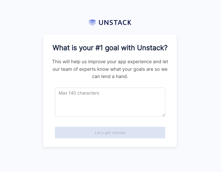
As part of our ongoing efforts to understand the reasons our users sign up for Unstack in the first place, we have added a popup question that appears when you first install the Shopify app

Pop-up Question

Capitalization and letter-spacing

If you're a user who likes the text of their headers or buttons to always be capitalized, lowercase, or mixed case you are in luck! With this release we shipped changes to the Style Guide which allows you to make those changes at the account level.

Product Collection Component Changes

Using component properties, we added several layout options to the "Product Collection" component. Specifically the ability

DDC Import & Export

Data Driven Content, or DDC is a beta feature that we're very proud of. However, as a beta feature there is a lot of work that still needs to get done. The release of the import & export feature is one of those things that has been in the works for some time and is a huge milestone for this tool.

Look for more on DDC soon!

Complete List of Resolved Items

  • Pushed a number of improvements to the start screen of the embedded app.
  • Added text transform options to typography options in Style Guide.
  • Added letter spacing options to typography options in Style Guide.
  • Fixed a bug where certain thumbnails would extend below the boundary of the product component.
  • Fixed a bug where the Product component in the editor would return "null:" if there product has no variant options.
  • Fixed a bug where media in the product component was clickable.
  • Added number of columns option to Product Collection component.
  • Added vertical align option to box settings.
  • Added DDC Import/Export tooling.
  • Fixed a bug with the FAQ component where it wouldn't expand properly.
  • Fixed an alignment issue in the Quotes/Reviews component.
  • Fixed a bug with the Quotes/Reviews component when used in a carousel.

Overview

For this release, we continued to work through changes to the component system which will allow us to further improve functionality. More on this soon! We also pushed a number of bug fixes.

Complete List of Released Items

  • Fixed an issue where the og:url found on Unstack pages would show the wrong value if that page was hosted through Shopify's proxy.
  • Fixed an issue where the page URL found at the top of the page editor, would briefly flash the wrong URL when first opened.
  • Fixed a vertical-alignment issue with text links in the Banner component.
  • Fixed an issue where the contents of code blocks were not showing properly within the page editor.
  • Fixed an issue with pricing text color when choosing light text on a dark background.
  • Fixed a bug that caused a users blog page to 500 after published a change to it.
  • Fixed a bug where blog articles were being listed with the blog name rather than the category name.
  • Fixed an issue with conditional content where the available options of one condition would be available as options of another, if the original condition was changed.
  • Fixed a bug with section formatting that would occur when adding an A/B test to a section.
  • Fixed a bug with HubSpot forms where adding them to a section would break the section.
  • Pushed a handful of bug fixes for the Product Custom Text component which were previously resolved for the Product component.
  • Pushed changes to the way Unstack calculates the a user's "first-visit" and pushed a change to how this is handled internally.
  • Pushed a change to the way that the component selector is sorted.

Overview

We shipped some pretty significant changes to the component system that will enable future functionality. More on that soon! We also fixed one bug.

Complete List of Released Items

  • Component system improvements
  • Fixed an issue where the landing page editor would sometimes crash when removing a product from a section

Overview

A small release with a handful of bug fixes and tweaks. Several new features in the works including Component Properties which is a set of changes to the section/component experience which will help to reduce redundancies with our current component experience. More on this when it's released in the coming weeks.

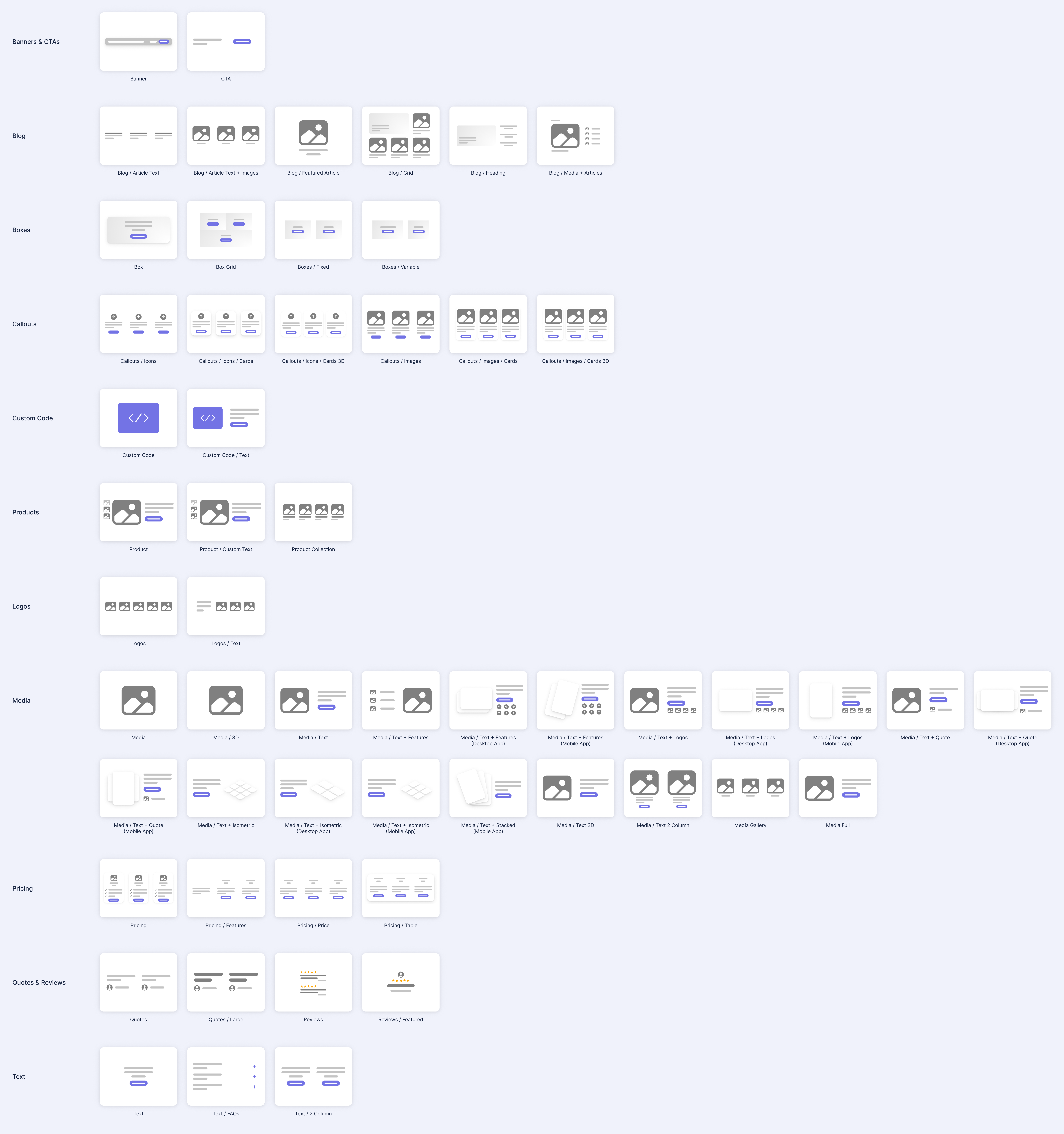
Recategorized Components

We spent some time reorganizing renaming components to make it easier to find what you are looking for in the component selector. We also added thumbnails for some of the components that didn’t have them. There is more work to come on this to make it even better, but it’s already easier to find some things.

Reordering and Renaming Components

Template Updates

We rolled out an update to allow our backend teams to more-easily launch the templates that they've been working on. This includes changes to way we generate screenshots of these templates as well as the way that we add them to accounts.

View all of our templates!

Templates

Complete List of Resolved Items

  • Rolled out a change to the way our components are categorized to make it easier to navigate.
  • Added support for keyboard handling to dropdowns when setting conditions.
  • Fixed a bug where the image of a variant wasn't updating when the variant was selected.
  • Adjusted the default state of box width to display "auto" instead of "none" .
  • Rolled out changes to our template screenshots to reduce file sizes and speed up the page.
  • Improved the handling speed of several backend jobs.
  • Adjusted all of the links used in the app to use a URL that lets our product, support, and marketing teams make rapid changes to them.
  • Fixed a bug with the image callouts component where the first icon in the section would be misaligned vertically.
  • Fixed a bug where the dynamic content would sometimes handle the "or" operator (the pipe character "|") incorrectly.
  • Fixed a bug where some users would get a 500 error when "choosing a product".

Overview

A tiny release with a few fixes and tweaks.

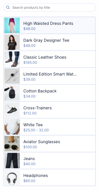
Polish on product list items

We squared up the product and collection thumbnails to better accommodate stores that aren’t using portrait images ( landscape or square).

We also improved the hover effects and made some other subtle style tweaks. This impacts the product selection drawers and the index pages for products and collections.

Product List Items

Dark and light text toggle on boxes

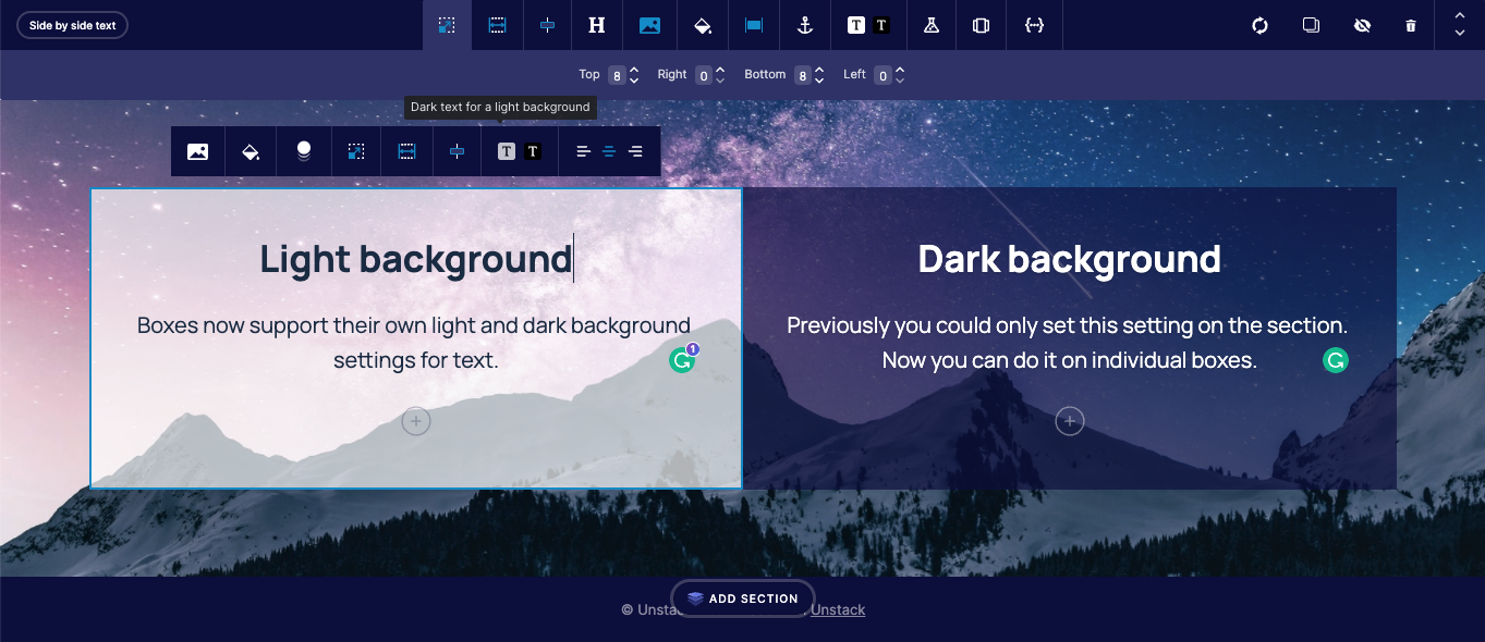
Boxes now support their own light and dark background settings for text. Previously you could only set this setting on the section. Now you can do it on individual boxes.

Both sections and individual boxes have this setting. If it’s not set on a specific box, the box will inherit the setting from the section.

Darka and Light Text Toggle

Complete List of Resolved Items

  • Pushed a several QoL updates for the list of products shown when selecting a product.
  • Added dark/light text toggle to boxes.
  • Pushed backend changes for how components handle properties.
  • Adjusted the spacing of action links when used as the CTA in a section.
  • Fixed a bug where a section could not be duplicated.
  • Fixed the link "Click Here" uses when saving a template.
  • Fixed a bug where the page manager filter for "Live pages with A/B tests" was not working properly.
  • Fixed a backend bug having to do with invalid Stripe subscriptions.

Overview

A smaller release, but we shipped a few features and tweaks in addition to a number of bug fixes. Tons of work on some new features and editor improvements that will both land in a future release.

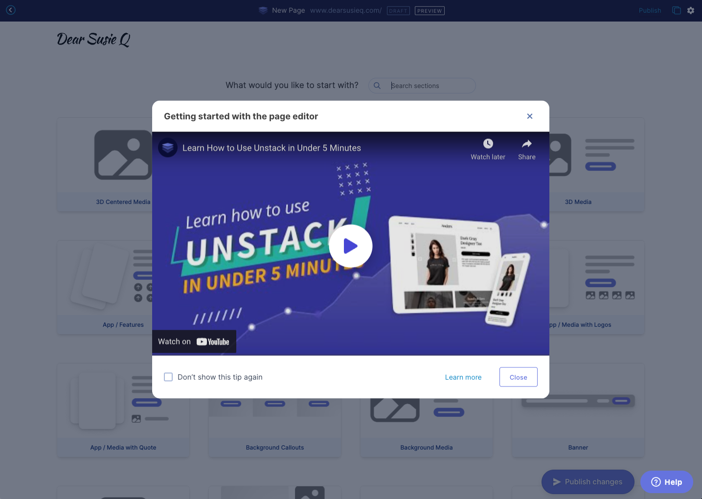
Intro video for the page editor

As part of our work to improve the onboarding experience, a popup intro video for the editor will appear the first five times you enter the editor. You can also dismiss the tip permanently if you choose to.

Introductory Video

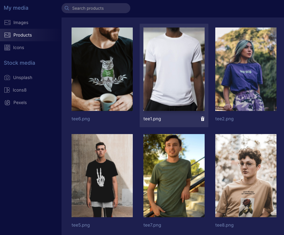
Product images for all media

There’s a new folder in the media manager for Products where images that are imported from Shopify products will appear. This will make it easier to use product images in any Studio component.

Product Images

Domain settings for Shopify

We cleaned up the domain settings for Shopify customers using the App Proxy functionality to load CX-Studio pages on their Shopify domain. When you’re using App Proxy it now shows “Point to Shopify” and you aren’t able to change it (we will probably enable people to change this in the future).

domain.png

Form Width

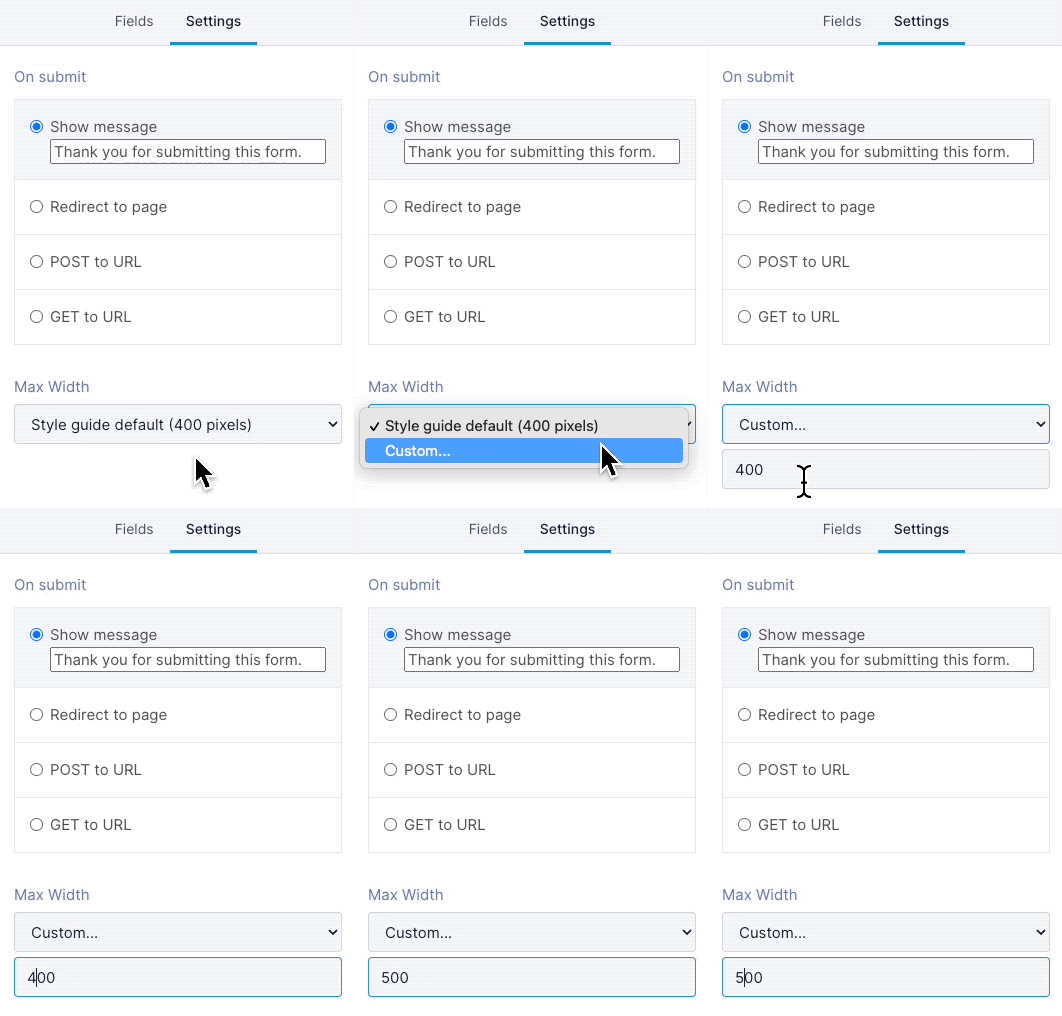
In this release, we rolled out changes so that you can set a custom width for a form. All forms will use the style guide setting by default, but you can now set a custom width:

  1. In the admin portal, under Forms, open the form you want to change

  2. Click on the Settings tab

  3. Under Max Width, select Custom...

  4. Enter a number and save!

    Form Width

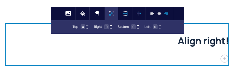
Text-align Right

You can now align text to the right! This is something we probably should have done a long time ago, but we’re only now getting to it along with a number of other editor improvements.

Rigt-alignment of Text

Complete List of Resolved Items

  • Added intro video for the editor.
  • Added deep-links. Among other things, this allows us to provide one URL that all users can use to access a specific part of their account. For example, https://app.CX-Studio.com/goto/landing-pages will now take you to the landing pages section in your account.
  • Adjusted media policy to allow product images to be used any place where media can be used.
  • Updated the Studio UI to account for Shopify plans which use the proxy by default.
  • Fixed a mobile-specific issue where text would overlap in the product component.
  • Pushed a change to allow users to be able to set a max-width for their forms.
  • Added support for text-align right.
  • Fixed an issue with our HubSpot integration which prevented users from being able to add their HubSpot forms to a page.
  • Fixed an issue where white backgrounds were mixing button styles when a dark background was used.

Overview

Another large release shipping a few key features and a ton of small fixes.

Shopify Free Plan

We’re now putting all new Shopify accounts on a free plan. This is a temporary change until we introduce multiple Shopify plans in Q2 of 2022.

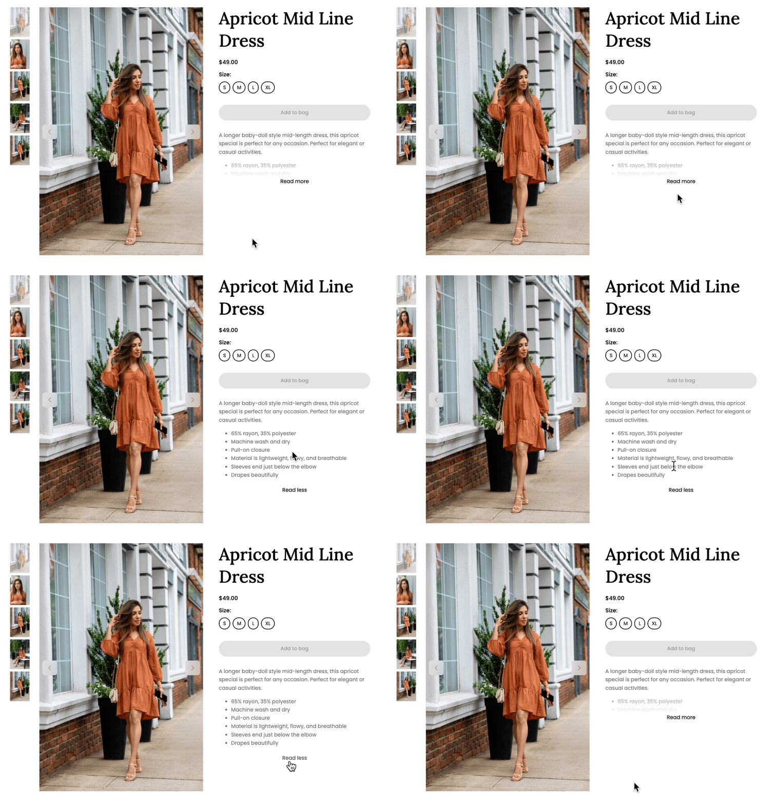
Collapsing Product Descriptions

Stores often pack product descriptions with content that’s valuable for SEO. When rendered inside of our product component that text spills down the page creating an odd unbalanced view.

In this release, we rolled out a change that hides the text behind a “Read more” link if it is longer than 5 lines.

Read More LInk

Resize-only for media

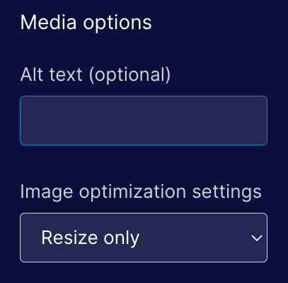
We’ve had a number of issues with image optimization being too aggressive so we’ve changed the default when adding media to Resize only.

Media Resizing

Deleting users & accounts

We added functionality for our internal teams to be able to permanently delete users and accounts from our database. In the past we haven't had a good way of handling this and previous requests took longer to resolve than we'd like.

JSX Rendering Backend

We shipped the next phase of the prep work needed to support Component Properties. When we rolled out refactor NoML to be more like JSX we added a translation layer to translate from the new syntax into the old. This allowed us to use to avoid rewriting the rendering layer. In this release we rewrote the rendering layer so it’s no longer using the old syntax.

Complete List of Resolved Items

  • Launched the free plan for Shopify.
  • Fixed an issue where templates with product collection components (but no product components) were asking for a product.
  • Fixed an issue where customers synced from Shopify has their locations malformed during the sync.
  • Rolled out an improvement for collapsing product descriptions when they are more than five lines long.
  • Fixed an issue where the "Add to Bag" button was missing from the editor.
  • Fixed another issue where the order of products in a collection component was different when viewing the component in the page builder compared to when the same component was viewed on a rendered (live) page.
  • Pushed improvements to our JSX rending backend.
  • Changed the default image optimization setting to "Resize Only".
  • Fixed an issue where some page settings would be auto-populated if using a page template.
  • Fixed an issue with landing page headers inheriting the wrong styles when rendering over a dark background.
  • Removed DDC option from nav menu on Free, Lite, Full, and Full+ plans.
  • Fixed an issue with DDC pages where they used the slug placeholder of "%" as value of both the canonical and OG:URL, URLs.
  • Removed contact.type & contact.persona from conditional content UI as neither are used.
  • Created a tool for our Support team to be able to delete users & accounts from the database.
  • Fixed an issue with the Pricing/Features section being cutoff when too many cards are added.
  • Fixed a bug that occurred when a date was removed from the settings of a blog article.
  • Fixed an issue where users weren't able to save a page when missing a required field.
  • Fixed an issue with an image in the "new lead" email notifications.

Overview

Another monster release for the engineering team packed with features, tweaks, and bug fixes! This work was delayed for a few weeks while we tested the new JSX syntax for NoML. As a consequence more issues were rolled into this release because it includes work from the past three weeks.

Showing a variant featured image

Shopify allows users to associate a single image with each variant. In this release, we added functionality to the product component that selects the variant image when the appropriate options are selected. This will zip to an image of the shirt in red when the red color is selected.

Banner Components

A reoccurring feature request, we implemented a basic banner component. That might sound kind of silly, but to date, we didn’t have a good way to build a component that had smaller buttons and padding. It’s now trivial to add a banner to any page.

Banner

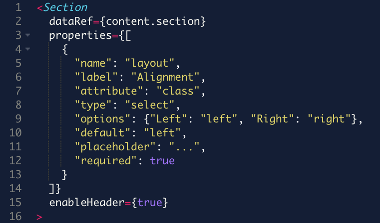
JSX-Style Components

We’ve reworked the syntax of NoML to align with React’s JSX syntax. This is one of the things we needed to push out to make it easier for us to iterate on components, allows us to render dynamic changes within the section editor, and is a syntax that is familiar to a lot of developers.

NoML Syntax

Custom Code with Text Component

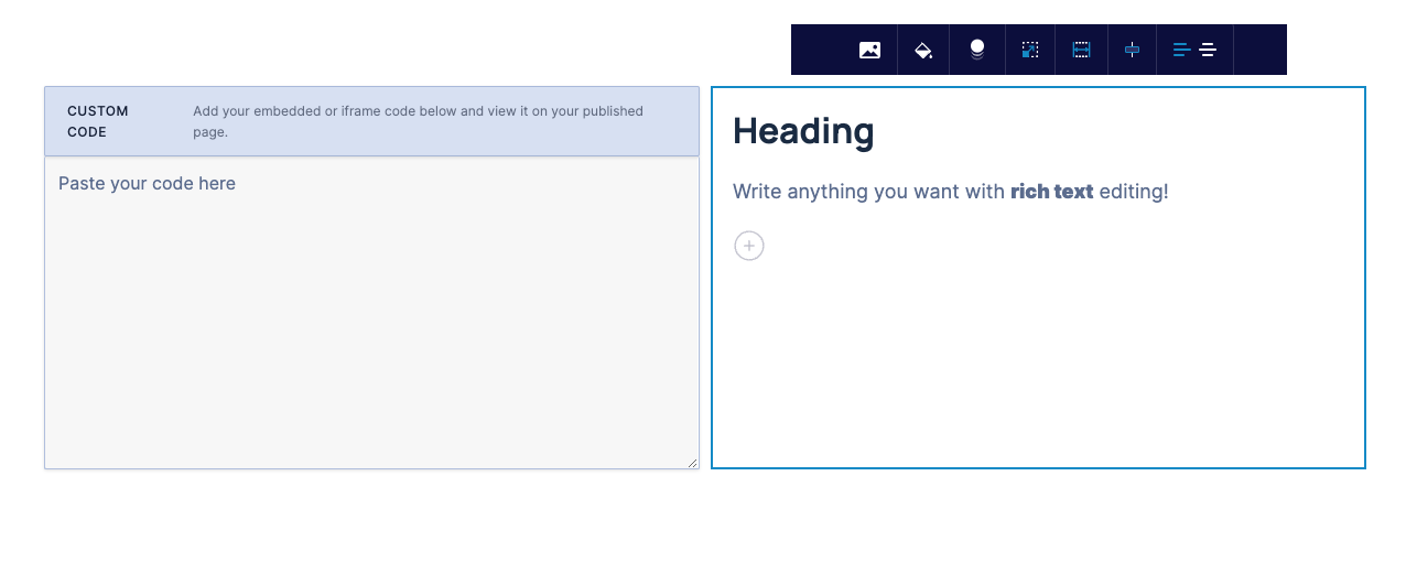
This behaves a lot like the Media component, but instead of an image you can add custom code. This will make it much easier to add custom embeds (for example a map) with text on the left or right.

Custom Code with Text Component]

Complete List of Resolved Items

  • Pushed several polish-updates for Conditional Content.
  • Added support for variant-specific featured images. Now when a variant is specified, the images used in the product component should pull from that variant.
  • New component: "Banner"
  • New component: "Custom Code/Text"
  • Pushed a change to the timing of account creation from Shopify.
  • Updated the language used in Shopify when setting a product as "Available" in Unstack. Previously this said "Manage Availability" - now it reads "Available to Unstack Page Builder".
  • Removed an upgrade prompt in app that isn't relevant to Shopify users.
  • Fixed the appearance of collection thumbnails when a collection had less that four products.
  • Removed an option to "Disconnect" Unstack from Shopify from the Unstack Admin.
  • Rolled out a series of improvements to improve the appearance of template thumbnails.
  • Fixed an issue where price, product options and other product info wouldn't load in the editor.
  • Fixed an issue where a backend job would sometimes break the connection between an Unstack account and the corresponding Shopify account.
  • Fixed a permissions issue some users ran into when creating a landing page from a template.
  • Fixed an issue with the product gallery arrows that would sometimes result in the arrows not being vertically aligned.
  • Fixed an issue where multiple versions of the same product could be added to a single collection component.
  • Fixed an issue where the order of products in a collection component was different when viewing the component in the page builder compared to when the same component was viewed on a rendered (live) page.
  • Fixed an issue where products deleted in Shopify would still show up in Unstack.
  • Exposed a public, read-only API for our global page templates.
  • Pushed a number of improvements to our usage of webhooks.
  • Pushed an update to allow website and landing page templates to be use interchangeably
  • Pushed an update to speed up the component-saving process.
  • Fixed an issue with landing pages where there would sometimes be extra padding at the top of the page.
  • Fixed an issue where some users weren't able to publish a page.
  • Fixed an issue where deleted authors wouldn't have the corresponding author-page also deleted/flushed from the cache.
  • Fixed an issue with delivery times of lead notification emails.
  • Fixed an issue where a landing page header would sometimes disappear.
  • "Contacts" renamed to "Customers" in the app and emails.

Overview

Following the end of the holiday season we shipped a number of quality of life improvements for components and a handful of other changes.

Better reviews ⭐⭐⭐⭐⭐

Our reviews component has been revamped to include better layout support as well as properties for toggling stars, avatars, and taglines.

Animated logos & more!

Our standard logos component has been updated with support for animated scrolling! We also added support for grayscale, black & white, or reversed filtering.

Content subscriptions are no more

While this is a valuable feature for people who want to require a subscription in order to access content, Stripe deprecated their payment forms entirely and is now telling users to use payment links to achieve the same functionality. We were faced with updating our code to use payment links instead of forms (which was costly) or phasing out the feature. As this is not a widely used feature we chose the latter.

Meta description is now optional!

Previously we required that users add a meta description to their page before we let them publish that page. This is no longer the case. While it can be important for SEO, people often bypass this requirement with dummy content. This is actually worse for SEO. And if you don’t need to worry about SEO for your use case it makes no sense to require it. Given this, we decided the best thing was just to make it an optional field.

Complete List of Resolved Items

Product Component

  • Tweak - Adjusted the "Product/Custom Text" section so that the images would be properly optimized.
  • Tweak - Adjusted the "Select a product" drawer so that the products would appear the same size regardless of how long the product name was.

Product Collections

  • Bug - Fixed an issue where small alt images would overlay on the bigger primary images.

Other Components

  • Feature - Improved logos component
  • Feature - Improved reviews component

Editor Improvements

  • Tweak - Updated the page editor to no longer require a meta description when publishing a page.
  • Bug - Fixed an issue where creating a new page from a template would sometimes lead to no header being set on the rendered page, regardless of what was defined in the page settings.

Official Integrations

  • Tweak - Stripe deprecation. Removed from list of integrations, removed option from gated content, settings, and " Payments" option removed from Unstack admin.

Overview

We had a monster release with a number of small, but significant features added to the product and a ton of bug fixes.

Better product collection component

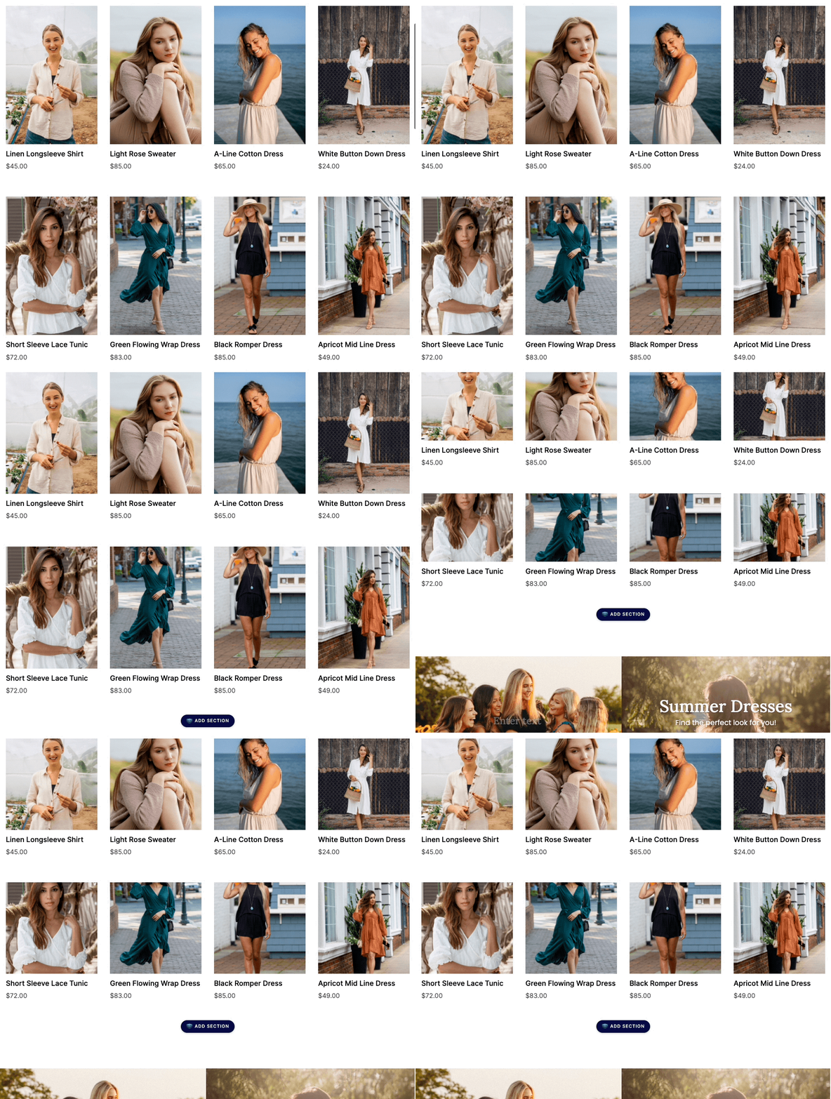
We just rolled out a new version of the product collection component. Not only does it look amazing compared to the old version it also allows you to automatically crop collection photos to a Portrait, Landscape, or Square aspect ratio.

Product Collection Component

Hello strike-through!

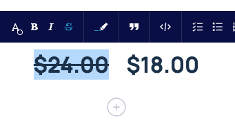
A reoccurring feature request, we finally had a chance to add a strikethrough button to the rich text editor. The needs of eCommerce customers made this a low-effort high-reward feature addition. Now customers can use strike-through to show price comparisons.

Strikethrough

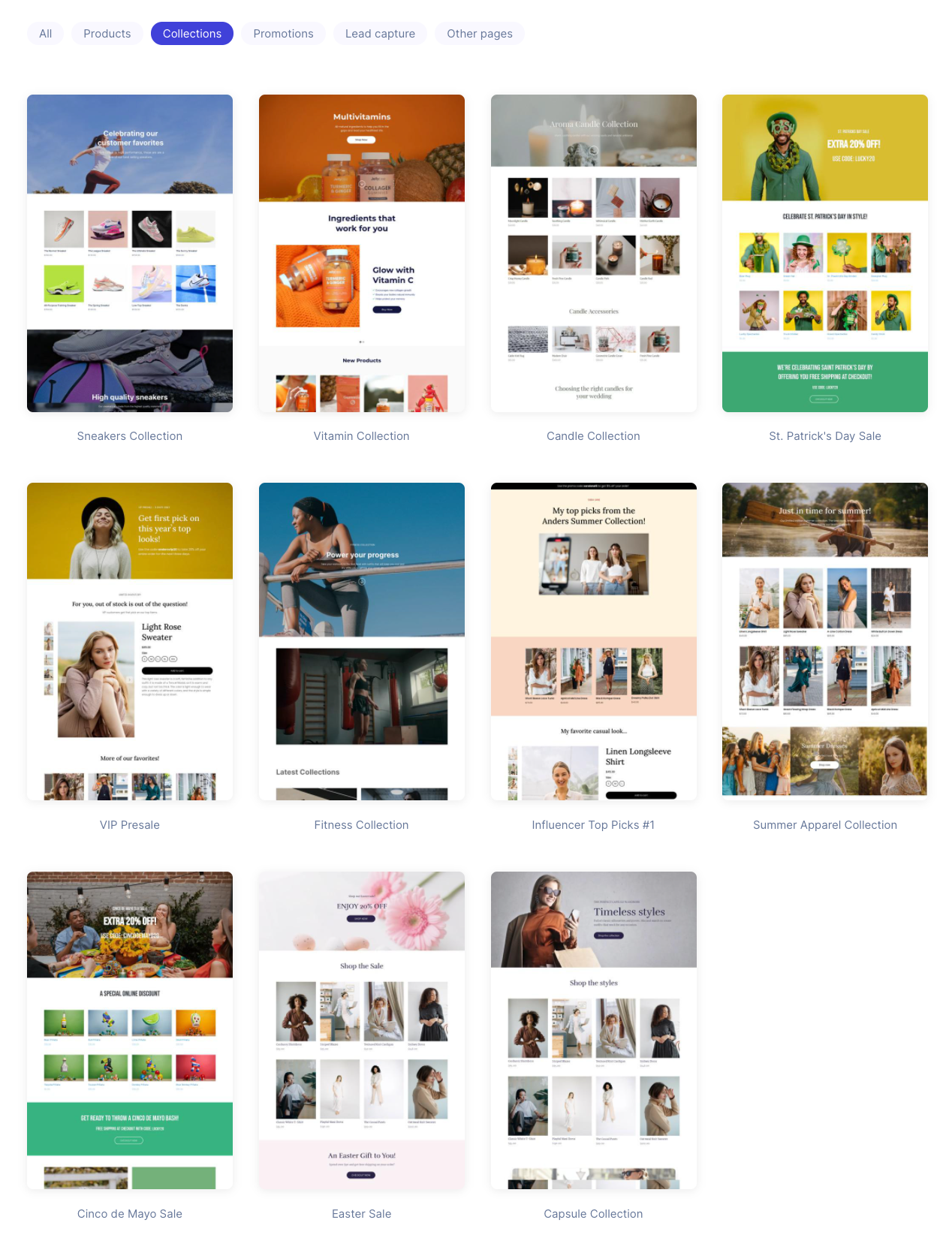
Better organization of templates

We now have more control over how templates are organized on the choose a template screen. New categories exist for Products, Collections, Lead Capture, and Other pages.

New eCommerce templates

Also new as of last week, we’ve added two additional landing page templates. Our first collection page template and a template that helps to demo our personalization features.

Much more to come on this front.

Personalized Demo

Collection Page Templates

Better sync for product changes from Shopify

This won’t be fully realized until future releases, but we shipped the first work that will enable us to sync product changes on the fly from Shopify. Sync will soon occur whenever a change is made to a product and you won’t need to start the sync job manually any more.

Complete List of Resolved Items

  • Added support for strike-through through our rich text editor.
  • Added support for syncing product changes more frequently via webhooks.
  • Adjusted the account-creation flow so that new landing pages aren't automatically created when a Shopify user signs up.
  • Fixed a bug where Shopify accounts were missing our HubSpot and Salesforce integrations.
  • Fixed an issue where the "Add to Cart" button wasn't working as intended.
  • Fixed a bug where choosing a product would sometimes break the app.
  • Fixed an issue with the cache that was preventing it from flushing when it needed to.
  • Fixed an issue where A/B tests were missing from Shopify accounts.
  • Fixed an issue where the featured image of a blog article wouldn't show in the "Large Media with Articles" component.
  • Fixed an issue where "pinned" articles were not visible in the app.
  • Fixed an issue where field values collected during a form submission wouldn't be saved to a contact.
  • Fixed a 500 error when exporting blog posts via XML.
  • Fixed a mobile formatting issue that arose when using a transparent header. The issue was that the logo and header text would overlap with one another.
  • Fixed a spacing issue that occurred on the component-selection screen.
  • Fixed an issue with pageviews not being tracked properly on dynamic pages.
  • Fixed an issue where checkbox fields weren't displaying their values properly within contact records.
  • Pushed a number of other backend (DevOps-specific) fixes as well.
  • Pushed several updates to backend jobs and automatic processes for our sales/marketing teams.

Overview

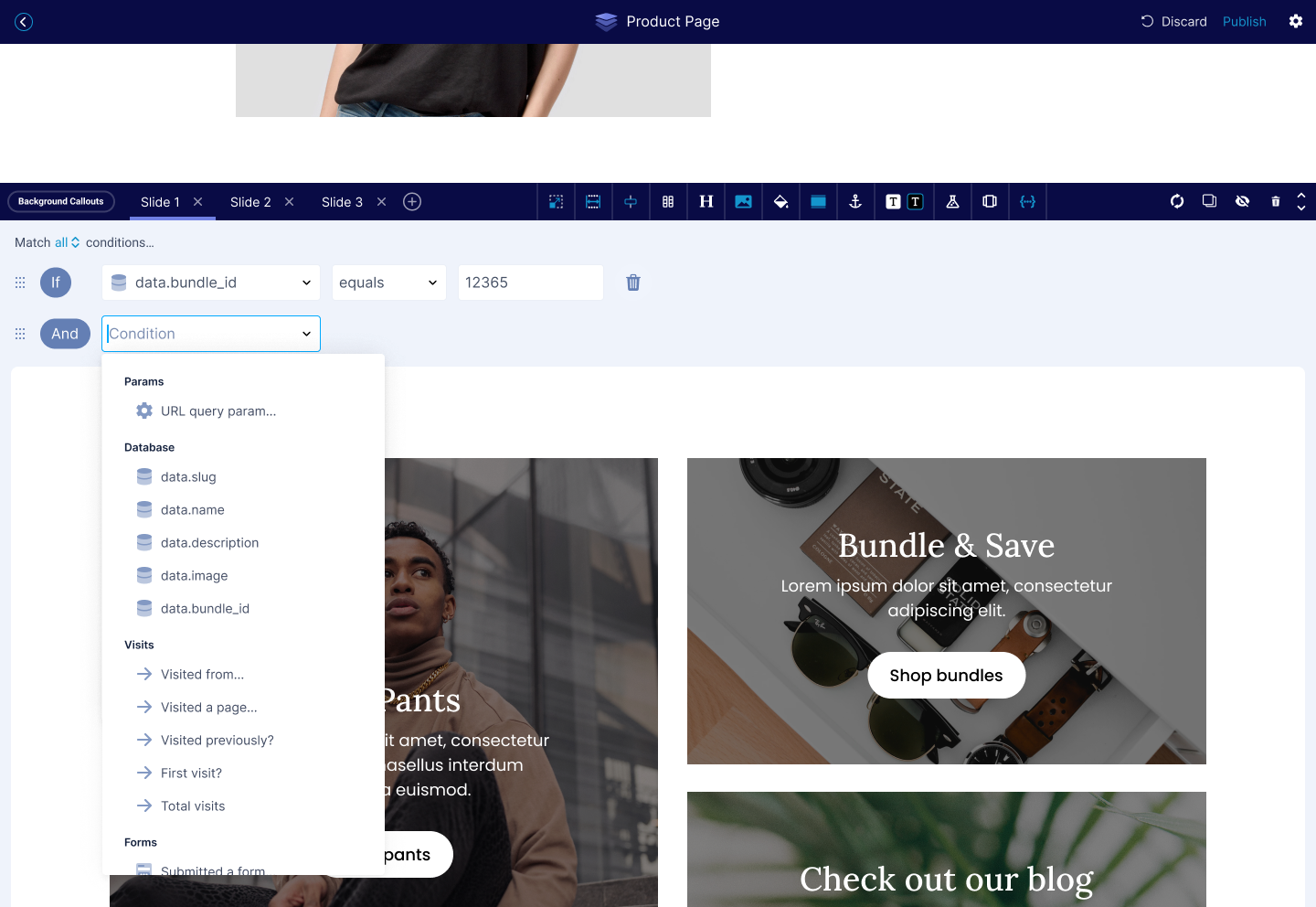
Launch of Conditional Content! We updated the new page flow to better support product pages. We also shipped a ton of bug fixes in this release and disabled Semrush.

Conditional Content for Personalization

Rounding out Conditional Content we’ve extended the functionality to support contact properties and behavior (in addition to the previous work for DDC).

This work makes it possible to support a bunch of additional use cases that are especially important to eCommerce customers who want to build personalized content for users. For instance, it’s now possible to show different content on a page for repeat visitors.

Conditional Content

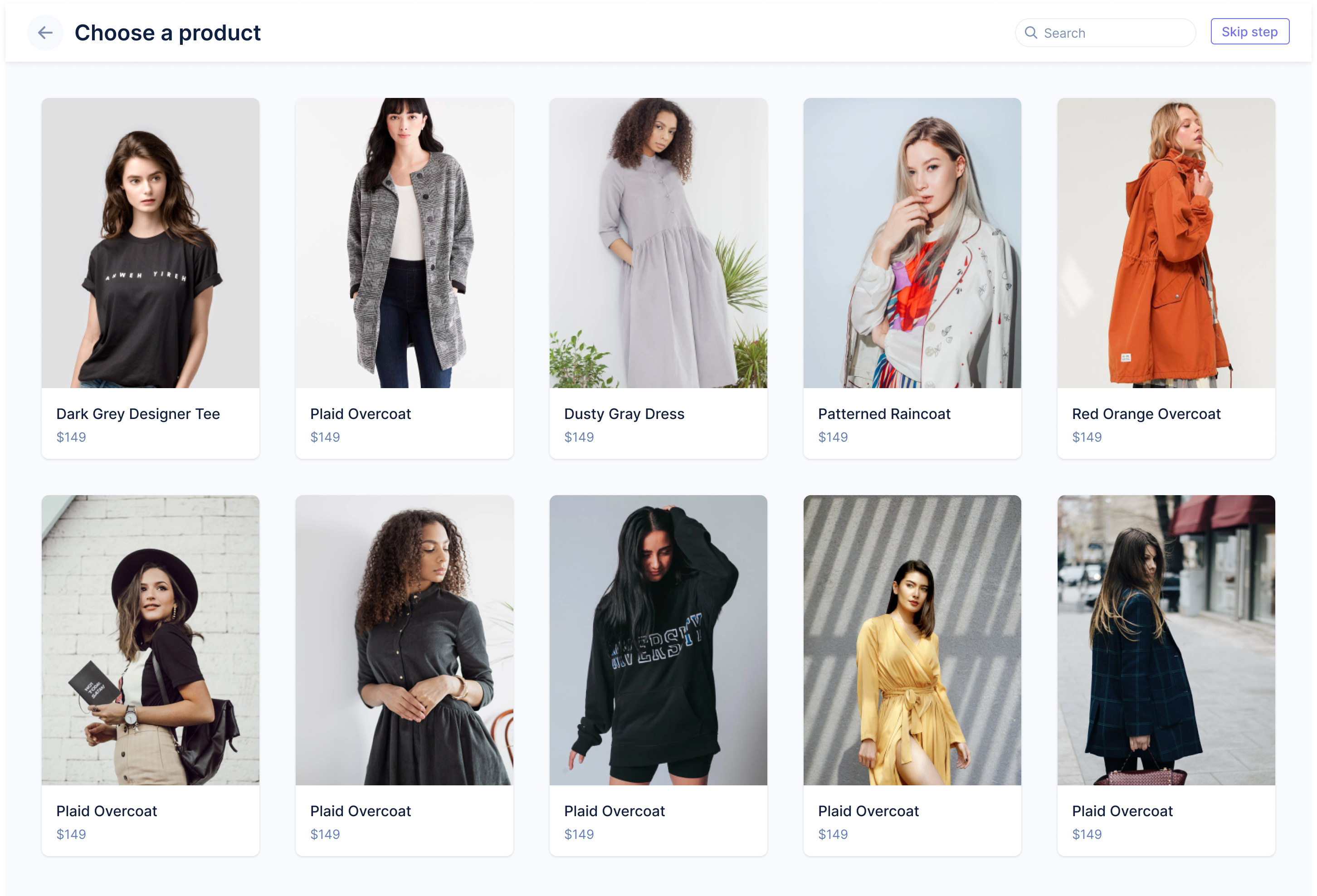
Updates to product selection flow

We’ve streamlined the process of adding a product to a page template by building it into the landing page flow. Previously, you would be dumped straight into the editor after selecting a product page template. Now you’ll be asked to select a product. As we continue to invest in improving our onboarding experience for Shopify customers you’ll see us ship more features like this.

Product Selection

So long, Semrush!

Our Semrush integration stopped working recently. As we were evaluating the work required to get it working again we decided to disable the integration for now because it is not used that much in the eCommerce space.

We may re-enable this in the future if there is the right kind of demand, but for now, so long, Semrush.

Complete List of Resolved Items

  • Pushed the final frontend changes for conditional content.
  • Adjusted the behavior of the app when adding a product to a landing page.
  • Removed Semrush reports from the app and navigation.
  • Fixed an issue where the URLs of pages generated through DDC were not included in the sitemap.
  • Pushed a fix for an issue where our MailChimp integration was not connecting properly.
  • Fixed an issue where "New Lead" email notifications were not being sent out in a timely manner.
  • Fixed an issue where some contacts from Shopify would crash the app.
  • Fixed an issue where accounts on our "Enterprise" plan were showing as being on our "Free" plan.
  • Fixed an issue where users could manually pick images for the product component. This was unintended as the chosen image could not be saved.
  • Pushed a QoL update for "Contacts" in Unstack loading very slowly.
  • Fixed an issue where users were not able to add logos to the "App/Media with Logos" component.
  • Fixed an issue where videos in the "3D Image Callouts" component would appear malformed in the editor and weren't able to be manually played.

Overview

This was a smaller release with mostly bug fixes and some prep work on features that will be released in January.

Complete List of Resolved Items

  • Pushed a fix for an issue where a 400 error would sometimes occur when an additional Unstack site was being created.
  • Pushed an update to our backend that allows our product team more flexibility when creating page templates.
  • Pushed a change to our backend to allow for conditional content support of contact properties and query-string parameters.
  • Fixed an issue where in-app payment history was showing duplicate invoices.
  • Fixed an issue where Shopify was showing the wrong subscription cost.
  • Fixed an issue where collections returned a 403 to Unstack.
  • Fixed an backend process for our marketing team where user info wasn't properly populating in their system.
  • Fixed an issue where the application would crash when editing a "time" column in a DDC table.
  • Replaced the Zapier logo in the Quickstart with a high resolution version.

Overview

A simple release. A handful of fixes, and a couple new features.

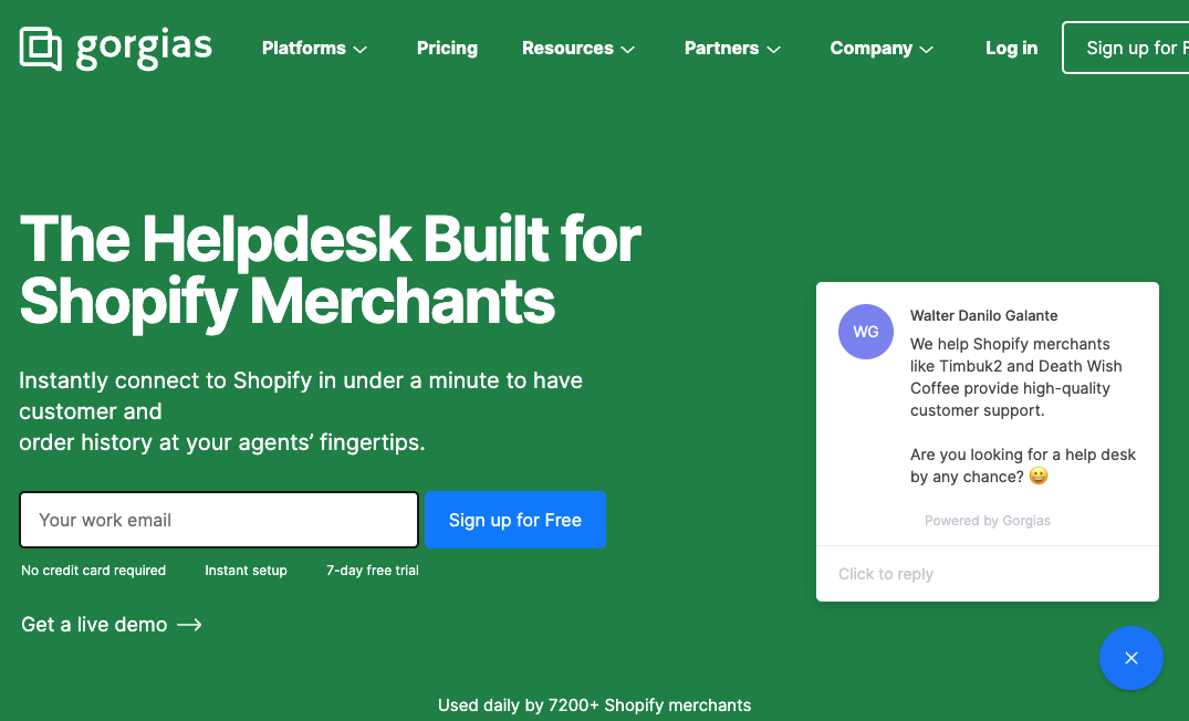
Gorgias Chat Integration

More common with eCommerce customers Gorgias (pronounced Gorgeous) is a helpdesk solution for storefronts.

Helpdesk

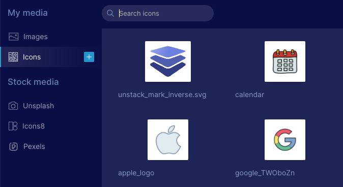
Icons & Images

We've tweaked the media manager so that you can now select any image or icon for any media component.

Now when you are selecting an icon the media manager will open on the "Icons" tab, but you will also be able to select " Images" to pick an icon instead.

The same is true for media which defaults to the "Images" tab but allows you to select "Icons".

Icons

Complete List of Resolved Items

  • Added a native integration for Gorgias Chat
  • Adjusted media selection to allow images from any category to be used in any context.
  • Backend work to allow website and landing page templates to be used in either context.
  • Fixed the link used in the email when alerting users of their A/B test results.
  • Adjusted all pages created on Unstack to include the OG:URL

Overview

We fixed a ton of bugs in this release, improved our Typekit integration, and added additional onboarding features that should make things easier for users to get started.

Typekit

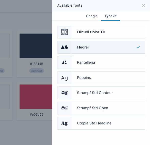
It's now super easy to use Typekit with Unstack. Simply add the integration from the Integrations page with your Kit ID and add the fonts you need from a new tab in the fonts menu.

Previously, users had to use custom CSS to utilize Typekit with Unstack. Now they can adjust all of these settings from within Unstack.

We're also detecting the kit ID from their company website or Shopify store and auto-enabling the integration during onboarding.

Typekit

Better onboarding

We've improved two aspects of in-app onboarding in this release:

  1. We're now automatically importing logos and styles from Shopify storefronts as part of the "add app" flow.

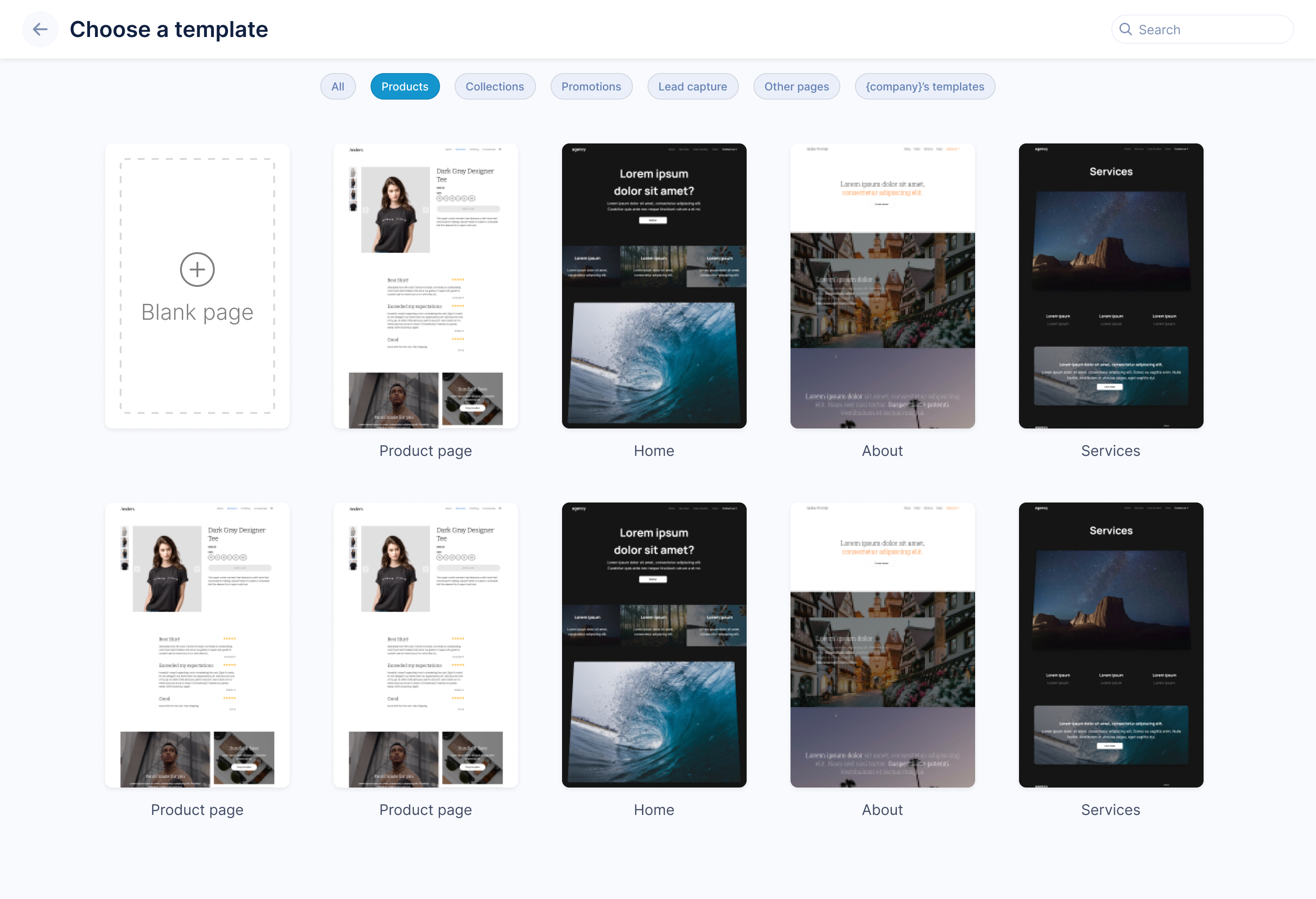
  2. We've also changed the "New page" flow so that it always presents templates to users. The template screenshots are now taller making it easier to see what you are selecting.

    Template Selection

Complete List of Resolved Items

  • Improvements to our Typekit integration.
  • Adjusted oAuth to Shopify process to use the Shopify store domain to scrape style data and pull it into Unstack. Additional scraping support for:
    • Typekit Integration ID
    • Logo used in Shopify
    • Additional Homepage Media Assets
  • Adjusted "Choose Template" screen to make it taller and easier to see what you're selecting.
  • Adjusted "New Page" flow to combine the "Templates" and "New Page" buttons.
  • Pushed changes to internal tooling for Support and Marketing team.
  • Added a new category to the media manager for "Products".
  • Pushed an additional fix for incorrect values being shown as the total number of form submissions.
  • Fixed an issue where the Google Search Console integration couldn't be configured.
  • Fixed an issue with the filter "Deleted Pages" being absent from landing page manager.
  • Adjusted the order that products in collections are rendered. Previously this was random, but now it should mirror the MANUAL sort order in Shopify.
  • Fixed an issue with landing page header appearance in the editor vs. the live page.
  • Fixed an issue that arose when deleting an account.
  • Fixed a media-display issue when a site is viewed using Microsoft Edge.

Overview

Several bug fixes went out this week. No banner releases.

Complete List of Resolved Items

  • Fixed an issue where adding a custom domain to an account created via the Shopify app would create malformed CNAME records.
  • Fixed an issue where blog styles were visible to Shopify accounts despite not having access to blog features.
  • Made adjustments to our HubSpot app to account for scope changes that HubSpot is making.
  • Fixed an issue where CSS stylesheets were being linked to in the footer of the HTML area of AMP pages.
  • Fixed an issue where media that wasn't being used on any page couldn't be deleted.
  • Adjusted letter spacing used for headers in the Unstack Admin.
  • Fixed an issue with logo alignment when using landing page headers.
  • Fixed an issue where users would get a 403 error when upgrading in-app.
  • Fixed an error where sections couldn't be duplicated in editor.
  • Other changes include several adjustments to backend sync and caching jobs.

Overview

Lots of small fixes in this release and other useful changes.

New Admin Navigation

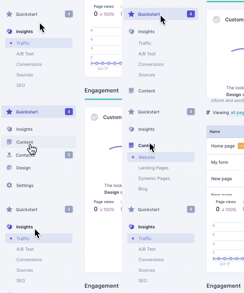
You'll notice that a snazzy new UX complete with animations. Content has also been slightly reorganized according to new information architecture.

New Navigation Structure

Tracking form landing page to checkout This is a critical part of our ability to deliver in-depth metrics to merchants and is our first step towards rolling out detailed sales metrics and more at a later date.

Complete List of Resolved Items

  • Adjusted the "Reviews" component to support a two-column layout. This allows more revies to be shown in a side-by-side manner.
  • Fixed an issue that the form "Submitted by" column was having where it showed the wrong count.
  • Made adjustments to "empty" product component in the editor.
  • New admin navigation and organization.
  • Added two-column layout for "Reviews" component.
  • Adjusted the appearance of the cart icon when used with dark backgrounds.
  • Removed the "Invite Collaborators" onboarding step from Quickstart when the user is from Shopify.
  • Adjusted the way the frontend handles a product-less and template-less Unstack account.
  • Fixed a permissions issue when reinstalling the app.
  • Fixed an issue where a certain product wasn't pulling into Unstack properly.
  • Adjusted the header notification that will sometimes appear so that it doesn't cover the "Save Row" prompt in DDC.
  • Fixed an issue that was caused when multiple foreign-key columns were used in a single table.
  • Fixed an issue where SVG images weren't rendering in DDC tables.
  • Adjusted a background job to reduce the total number of API calls that are made.
  • Rolled out improvements to integration encryption.
  • Fixed several minor styling issues with the navigation menu.
  • Fixed an issue with broken media in pre-builts when adding them to other pages.
  • Fixed an issue where RSS feeds weren't generating properly if the feed used non-English characters.
  • Updated the URLs of our Terms of Use and Privacy Policy when gating content.

Overview

The banner feature for this release is conditional content for DDC. We built this feature to enable a beta user of ours to hide and show content for their pages based on content in their data tables. We're also working on conditional content for all pages to support personalization, but this will come in a future release.

We also fixed a ton of bugs in this release and rolled out better synchronization of properties across internal tools to make it easier for Marketing and Customer Success to build engage with users.

Complete List of Resolved Items

  • Released an update to allow our backend to properly handle conditional content with DDC pages.
  • Released an update to allow our frontend to properly handle conditional content with DDC pages.
  • Adjusted backend to create better user properties in our internal systems. Custom events were also added.
  • Improved the Product component with two new layouts: Offset and Collage.
  • Fixed an issue where Checkout would sometimes fail.
  • Fixed an issue where "Company Name" in Unstack would be blank for Shopify users.
  • Fixed an issue where certain products wouldn't pull into Unstack from Shopify.
  • Fixed an issue where the "Add to Cart" button would break a page when using the "Landing Page" header type. Also fixed an additional issue with the appearance of the cart on these pages.
  • Fixed an issue where a previously-configured custom domain would sometimes disconnect.
  • Fixed an issue where the cart would sometimes fails when adding specific products.
  • Fixed an issue that would sometimes arise when a user re-adds the Unstack app to their account.
  • Fixed an issue where certain items wouldn't sync to collections in Unstack even if they were part of the collection in Shopify.
  • Fixed an issue where "invalid JSON" was being included on AMP pages.
  • Fixed an issue where previous versions of blog posts would sometimes 404.
  • Adjusted how the app handles the appearance of accounts without logos.
  • Fixed an issue with site integrations where the settings wouldn't be shown after configuring.
  • A fix for an internal billing processes was also released.

Overview

No definitive theme of this release, but many bug fixes and tweaks were released.

Complete List of Resolved Items

  • Fixed an issue where the publish and unpublish product links weren't working.
  • Fixed an issue where Variants were not showing properly in Unstack
  • Fixed a backend job that would sometimes fail to handle product updates.
  • Adjusted the "Add to Cart" button so that it's position in the editor is the same as the published page.
  • Adjusted an issue where a section that referenced a child component wouldn't link to the parent component.
  • Replaced PNG versions of social icons in the footer with SVGs.
  • Moved all component CSS to an external stylesheet to improve page speed performance.
  • Adjusted the appearance of the chatbot on "app.unstack.com".
  • Made changes to component versioning process.
  • Fixed an issue where a deleted blog article would auto-redirect to "/blog".
  • Fixed an issue with form spacing and styling.
  • Adjusted the layout of the "New Lead" email so that the "View Contact" button is centered vertically.

Overview

The theme of this release was overwhelmingly Fix Shopify Bugs.

That's right! As we worked on testing the app in preparation for submitting it to Shopify, we found numerous bugs. These were the sort of thing that would trip up the unsuspecting user and would result in a bad experience. We triaged the bugs we discovered and hit the most important ones in a week focused on Bug Bash.

In total, we fixed 18 bugs in this release and shipped 14 tweaks.

Complete List of Resolved Items

  • Fixed a bug where adding a product to your cart would still show the "Your bag is currently empty" text.
  • Fixed a bug where Times New Roman was being used as the font in cart drawers.
  • Fixed an accessibility issue for Unstack account settings on smaller screens.
  • Fixed an issue where a blog "fetch" job would fail.
  • Fixed an issue where the variants column would always be empty.
  • Fixed an issue where the Collection component would default to two products, instead of four.
  • Fixed an issue where deleted product images in Shopify would continue to show up in the product component in Unstack.
  • Fixed an issue where the user is sent to the wrong page when dismissing the "Quickstart".
  • Fixed an issue where a black check SVG icon would flash on the screen before the in-app settings would load.
  • Fixed an issue with broken links in used in settings.
  • Fixed an issue where adding a product to your cart would return "Undefined".
  • Fixed several backend issues that will help to make the app more stable.
  • Fixed an issue where editing the product component would return "Not Found".
  • Several internal updates for processes surrounding email campaigns and support tooling.
  • Adjusted collections so that they show images from multiple product better.
  • Adjust the default list of products in components so that it sorts by best selling or last updated.
  • Adjusted the Shopify Cart to only initialize once a product is added or an icon is clicked.
  • Changed the default component for landing pages from "CTA" to "Product" when Shopify is connected
  • Adjusted the installation process so that reinstalling the app goes to the embedded app in Shopify rather than the Quickstart.
  • Fixed a bug where prices were not being shown in the page editor.
  • Fixed a bug where header background color was missing.
  • Fixed a bug where AMP pages were sometimes throwing a 500 error.
  • Fixed a bug where partner sites would be created with the staging-version of a widget.
  • Fixed a bug where blog publish dates would appear in Arabic.

Overview

This release included a variety of things from improvements to internal tooling, new integrations, bug fixes, and more.

Buy buttons moved above product description, & other small tweaks

A small update, but significant for our Shopify customers: We've moved the buy buttons above the description on the product component. This puts it in a more prominent place, and works better for products with really long descriptions. Really long descriptions could even push the button below the fold.

We also removed FAQs from product component and fixed the sticky details section for the vertical images layout.

Rearranging UI Attributes

Complete List of Resolved Items

  • Buy buttons were moved above the description
  • FAQ section was removed from product component
  • Fixed a bug where product details were not sticky and would not scroll with images when using the "List" layout of the Product component.
  • If one exists, the URL that a product collection component uses has been changed to that of the PDP. If one doesn't exist, then "online_store_url" is used.
  • Fixed a bug where the incorrect prices were being shown for products.
  • Fixed a bug where the templates page wasn't working properly.
  • Fixed a bug with the back button breaking the templates page.
  • Pushed an update for increased site security for Shopify.
  • Fixed a bug with page redirects when the pages are created via DDC.
  • Fixed a bug where users on our Full Monthly plan couldn't add SSL to their account.
  • Fixed a bug where "Save and publish" button in an article's settings is not reset to it's original state when there is an error saving an article.
  • New Integrations
    • Padeo
    • Typekit (JS only)
    • jQuery

Overview

Several Shopify-specific improvements to the app as well as a number of bug fixes and tweaks.

Collections Admin Page

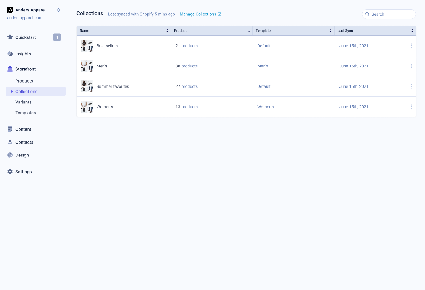
Similar to the product index page the collections index will help users see the collections that have synced with Studio. This should help us debug sync issues and give users greater confidence in understanding what CX-Studio has pulled in from Shopify.

Collections Index

Complete List of Resolved Items

  • Disabled the use of ecommerce components with Carousels
  • Addressed an issue where the Shopify logo wouldn't appear on the "connecting" screen when initially connecting Studio to Shopify.
  • Addressed an issue where the footer address overlapped with the menu in the footer.
  • Addressed an issue where XML Import didn't do anything when a file was uploaded.
  • Fixed an issue where DDC users were not able to access columns they added to their data table.

Notes for releases older than those documented in the release notes section of our knowledge base are not available for many reasons. In particular though, our development process evolved quickly to meet the needs of the business; therefore our release process has changed dramatically from what it once was.

All things considered, if you have any questions about this please reach out to our support team for further assistance.